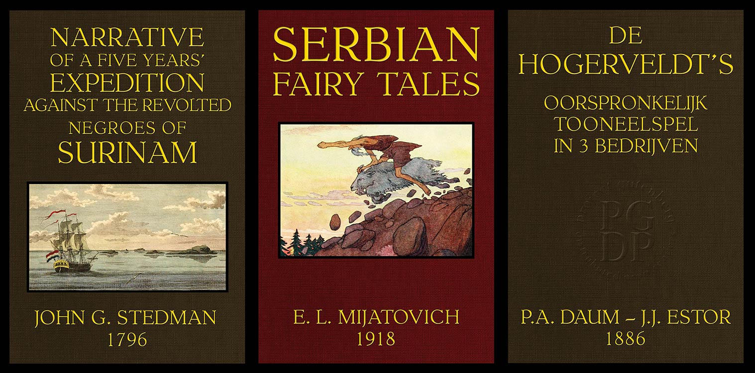
When I first discovered Distributed Proofreaders via a Google search, my quest was like that of many who were looking for an interesting and challenging activity during the pandemic. Turning public domain books into free e-books for Project Gutenberg – preserving history by proofreading one page at a time – seemed ideal. And one thing that particularly drew me to Distributed Proofreaders was that there was an active forum where like-minded folks could share knowledge and chat.

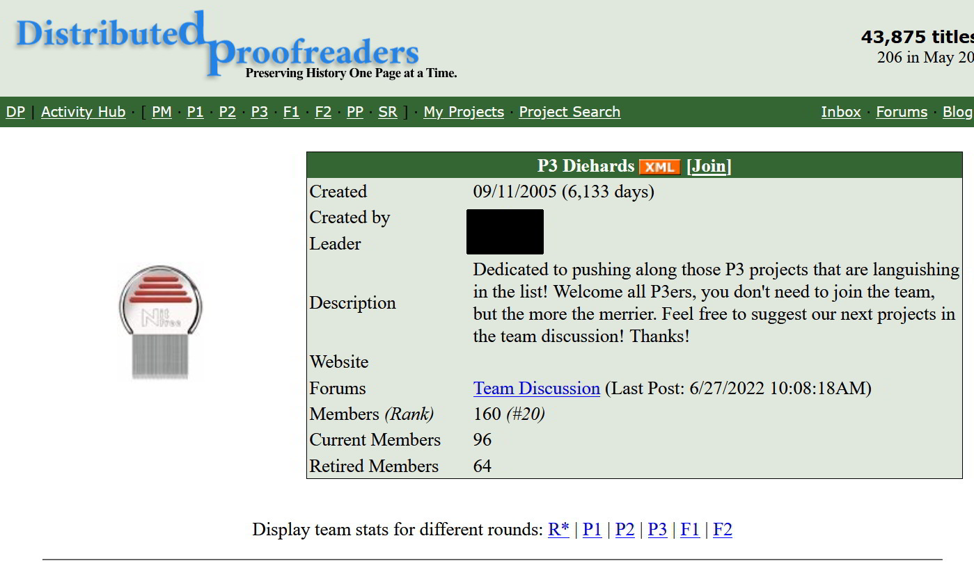
I stalked that forum for a few days and noticed one particular forum thread was quite active – P3 Diehards. I said to myself, “I want to join that fun team.” Problem was, I was not a P3! P3 is the top of three levels of proofreaders, and the privilege must be earned.
And so my Distributed Proofreaders journey began, going through the registration process, taking the training quizzes, and starting at the lowest proofreading level, P1. I had my blinders on and was only interested in proofreading so I could qualify for level P3. Occasionally, on my breaks, I would browse the forum to see what everyone was talking about. There was always something complex that people were working through with help from others. It all sounded too bothersome and beyond my abilities at the time. So, back to proofing I would go.
And then one day it happened. A private message arrived in my inbox announcing my access to P3! I think it was maybe 30 seconds later I became a member of the P3 Diehards team. What a great group and a great goal – to save the old books from languishing in the P3 round for more than 100 days. Of course, there are other great teams at Distributed Proofreaders; this one just spoke to me. (I even wrote a poem about it!)
Fast forward two years, and a new interest was sparked to investigate some other parts of Distributed Proofreaders. There’s Formatting, Content Providing, Project Management, and Post-Processing. I decided I wanted to try them all!
Starting with formatting seemed like the logical first step. At first it’s difficult to understand which tags (such as for italics and poetry and so forth) go where, and more importantly why, but it is rewarding when the second level formatter, F2, confirms that my page was done correctly.
Next step: Project Manager (PM). A PM guides a book project through the rounds of proofreading and formatting and answers questions in the project discussion. I was prompted to this endeavor by a plea for more content to be provided for new members. However, I couldn’t yet create my own projects to manage, so I adopted a few from others for awhile. With kindness and expert knowledge, my mentor, Fay Dunn, guided me through setting up my first project and several more after that. It is fun to watch my projects going through the rounds, some more popular than others, but they are all like “my kids.”
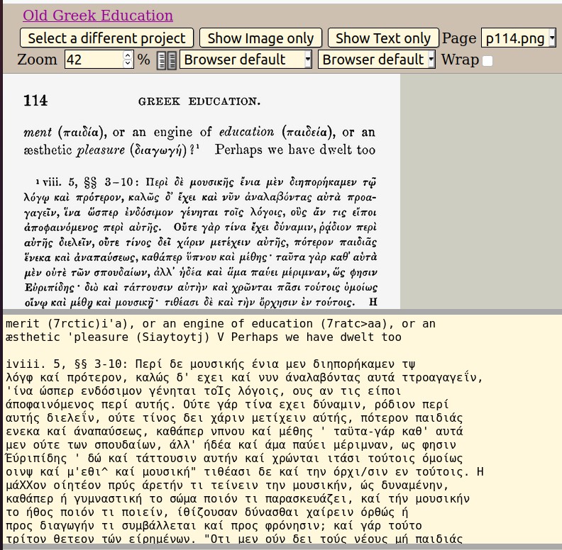
So that meant the next step needed to be learning Content Providing (CP). CPs select books for processing through Distributed Proofreaders, harvesting page images from online sources and converting them into editable text using optical character recognition. For this step, there were nearly a dozen software applications that first needed to be downloaded. And, of course, about half of them were problematic with my device for one reason or another. BUT, there’s a forum with lots of knowledgeable people from all over the world. They came to my rescue, and finally everything was working.
It was slow going at first, what with learning all this new software AND the CP steps. One of those steps is obtaining copyright clearance from Project Gutenberg, because everything we work on has to be in the public domain. I can’t describe the thrill when I see the clearance email from the copyright team approving a project. I’ve now CP’d 10 projects and was recently handed my graduation diploma by my wonderful mentor!
Post Processing (PP) was the last on the list of areas to tackle. PPers convert the proofread and formatted text into its final e-book format for Project Gutenberg. This turned out to be the most arduous process. There was more software to download and learn, as well as learning new concepts and new lingo used in the Guidelines. Luckily my PM/CP mentor felt brave enough to help me through it all. After a crash course in HTML and CSS and some peeking at finished projects, I somehow managed to crank out my first PP project recently. A good amount of time will need to lapse before I tackle another PP project, but I have so much respect for those who get these books onto the Project Gutenberg site.
It’s mind-boggling the amount of intelligence in this Distributed Proofreaders pool of volunteers, from solving difficult software issues, to proofing questions about any known language to man, to devising detailed search functions; there’s always someone to provide the answer.
This journey has been one of the best experiences of my life. I conquered some complicated (for me) challenges. I almost gave up a couple of times, but my mentor kept encouraging and reassuring me. I’m so glad I persisted, as it gave me the opportunity to rub elbows with some brilliant, clever, and creative minds from around the world. It is a privilege to be among them.
This post was contributed by Susan E., a Distributed Proofreaders volunteer.


 Posted by LCantoni