Distributed Proofreaders volunteers work hard to make the e-books they contribute to Project Gutenberg as user-friendly as possible. Among the things we do to that end is creating e-book cover images to make it easy for readers to find e-books of interest to them.
The role and requirements
Book covers in the digital age have taken a different role. Where in the past covers and dust jackets served to protect and later also advertise the book, they now mainly serve to advertise the book and make it easy to quickly locate it on a computer or e-reader screen. With that changed role, the requirements for book covers have also changed.
In short, the role of a book cover in the digital age is to
- Invite a potential reader to give it some attention.
- Provide an easy-to-locate icon in e-book readers or computer screens, so it can be found quickly.
- Provide a reasonably sized, readable short title and the author’s name, so people can ascertain they have selected the book they want.
- Give some impression of the type of content to expect.
All the while considering that a digital cover is now often just the size of a postage stamp.
A short history
Historically, decorated book covers are a relatively new invention. Books started to be sold in neatly designed covers only by the end of the 19th Century, and in some countries even later. Book buyers were expected to provide their own cover and binding, as desired and fitting for their personal library. So the publisher just sold the book as a bound stack of pages with a nondescript paper cover. That is why old libraries often look very uniform, with all those similarly and often richly bound and decorated volumes. (Our 34,000th title contributed to Project Gutenberg was a manual of artistic bookbinding published in 1878.)
Since books are stored in bookcases or cabinets with only their spine visible, the publisher needed only to put identifying information, such as the title, on the spine. The cover could remain boringly neutral, or, as with some ancient bibles, heavily decorated, but there was no need to put a title on them.
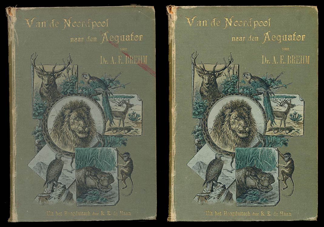
Fortunately, many of the originals we work from at Project Gutenberg are late 19th- and early 20th-Century titles, which often do have nice book covers. However, even when the book we are digitizing does have a cover, it is the part of a book (after the spine) that is most likely to suffer from wear and tear, stained with ink and coffee, mutilated by repeated unprofessional repairs, and defaced by libraries who like to put stickers with shelf locations and bar-codes on them. They are also most exposed to sunlight and so end up discolored.
Even then, such covers were designed to be attractive when placed in the book shop’s window, on a table, or when pulled from a shelf by a prospective buyer, so the requirements for large-size titles and author names are quite different from those you’ll need on a postage-stamp-sized digital image.
Challenges
When dealing with book covers, we at Distributed Proofreaders face a number of challenges. It is our intention to reproduce the original book in its full glory, “the book, the whole book, and nothing but the book.” Of course, with the transition to a digital format, we will lose some of the artifacts of the paper medium, such as page headers and page numbers, although we often retain the latter as small notes in the margin. Similarly, book covers will have to be reinvented for our books reincarnated in their digital form.
When preparing a book for Project Gutenberg, we will address these challenges in different ways.
Locating a good quality cover
First of all, we prefer to use an image of the original cover, so if we have one, we can use that as a starting point. In that case, it often requires some digital restoration. But before we invest in the labor-intensive process of restoration, we’ll seek out alternatives. If we don’t have a good quality cover, but have some idea of what it looks like, our first step is an internet search. Surprisingly often, better-quality scans of the same cover can be found, and sometimes those can be used. We need to be sure to pick only scans of a truly matching cover (i.e., same edition and printing), both to avoid a copyright violation, and to maintain the integrity of the e-book edition we’re making. Covers tend to appear in far more variations than the book itself, even within a single print-run.
Digitally restoring a damaged cover
If our search fails to unearth a good-enough cover, we will fire up our photo-editing software to restore what we do have. My personal guidelines in digital restoration is not to try to reconstruct an as-new cover (it would be nice if such a cover is still available), but only to remove mutilations like bar-codes and disfiguring damage, such as scratches and stains. Smaller aspects of wear and tear I will leave as is: it is not a shame to be old and look it. What I will also try to do is brighten up the colors, and restore color balance. Of course this involves a lot of guesswork, but again, if we can find alternative images on-line, even if tiny photographs, they can give us an indication of the original colors if our copy is particularly discolored.


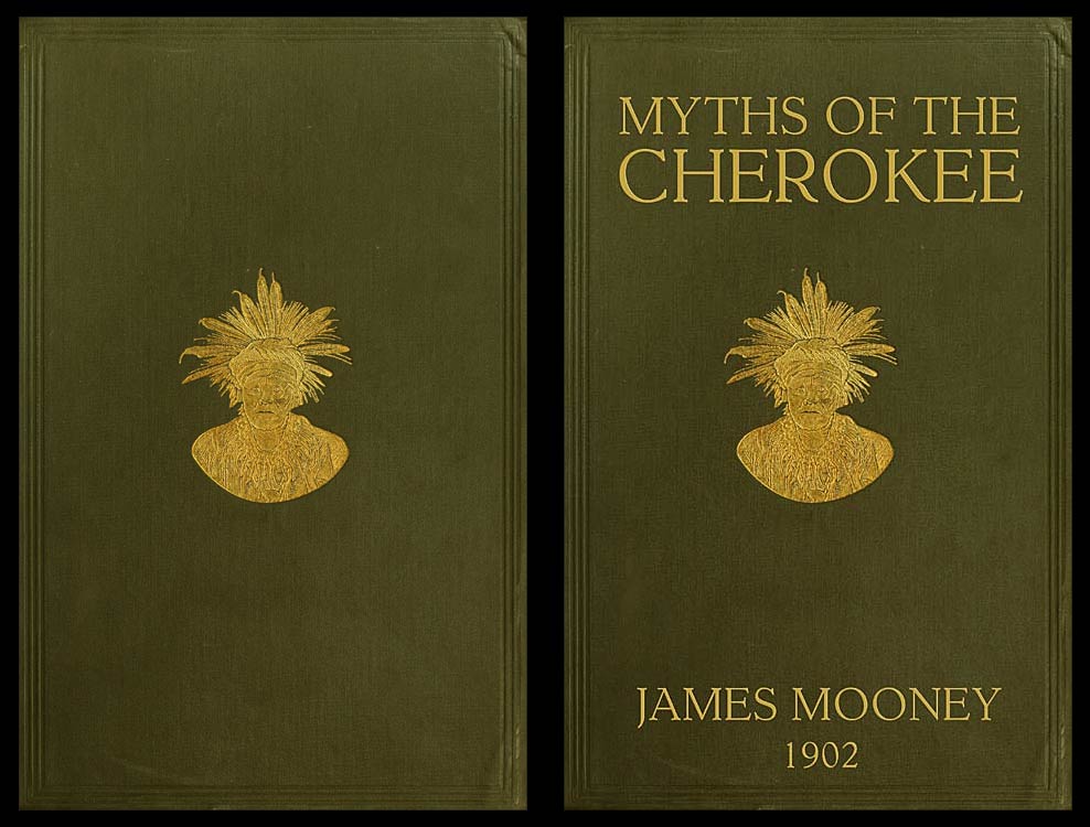
Adding titles and authors to original covers
As explained above, the original cover will often not mention the title or author at all. In such cases, to make it easier to recognize a book, we can decide to digitally add the title to the front, — that is, if the original design leaves space for it, which it often does. When adding the title and author, it makes sense to use a typeface matching that of the spine (if known), or the title page. Sometimes we can also use the title from the title page directly, manipulating the color and appearance to blend in with the original cover design.
Designing our own cover
Then we come to the point where we have no cover to start with at all. The book at hand is in a generic, unmarked cover, or we have none at all, for example when we work from a set of scans produced elsewhere. In that case, we will design a new cover. From here onward I will concentrate mostly on the way I do this, as other volunteers may have different procedures. It may be tempting to go all overboard and design something really fancy, but here I normally try to restrict myself and keep it functional.
One starting point I often use is the scanned cloth pattern of a book’s back to serve as a generic background. I derived a range of color variants from it. I will pick one color, depending on my mood and gut feeling of what would be appropriate for the book, and will add the original title, author, and year of original publication in a centered design. If the book itself includes a suitable illustration, often the frontispiece, I will use that. If not, I will slightly emboss a generic “PGDP” design on it, but won’t use artwork not present in the source, because of the copyright implications that might have. Balancing out the letters takes some puzzling with font-sizes, splitting lines, and letter-spacing, but normally, I am able to produce a reasonable new cover in some 15 to 30 minutes. Not perfect, probably not to everybody’s taste, but better than auto-generated.

I normally use serif typefaces, capital letters, and symmetrical design, because that was the standard in the era most of our books where produced. Asymmetric designs only started to come into vogue after the 1920’s, and thus are inconsistent with most books’ age. I still don’t feel the need to fully emulate an old style cover: I typically use somewhat brighter and larger letters, and prominently place the year of the original copy at the bottom of my design. This should immediately signal to the reader they are dealing with an old book in a new digital cover.
Some things that work less well
An alternative I regularly see is to use the title page as a replacement for a cover. I am not a big fan of that, because title pages are far more similar to each other and often black-and-white, so they lack distinctiveness. Besides that, they often include more detailed information, like the publisher’s name, author credentials, and such, given in a much smaller type. Imagine what it does with your ability to spot the book you’re looking for on a screen filled with postage stamp sized title pages in an e-reader.
Not all books in Project Gutenberg have book covers, so as a gap-stop measure, PG has a system to generate generic covers automatically. The results are not always satisfactory, because the software we use isn’t smart enough to understand what part of the title is most significant and to tweak letter sizes and spacing accordingly to obtain a pleasing result.
Finally, a little searching on some large commercial e-book platforms will reveal a range of newly designed covers for public domain books (the texts for which are often harvested from Project Gutenberg’s offerings in bulk), which range from boring to utterly hilarious: using inappropriate photographs on designs that make serious literary classics, even non-fiction, look worse than cliché Harlequin romances. Such things should not happen at Project Gutenberg, except when we keep the original pulp magazine cover that happens to be equally cringe-worthy, such as this:

This post was contributed by Jeroen Hellingman, a Distributed Proofreaders volunteer.


I pretty much do exactly what’s described here, but couldn’t have explained it nearly as well. And the example covers look great.
The timing of this article coincides nicely with the updated DP/PG guidelines for cover dimensions.
Thanks for this post–and for the link to hilarious book covers. What a hoot, and thanks to the DP book cover creators for NOT making covers like those!
I enjoyed reading this article. The illustrations really add to it. It’s nice to get insight into one of the amazing contributions of the pgdp volunteers.
Jeroen’s very best technical, æsthetical, and ethical standards. What else?
Olive.
Another interesting blog on the automatically generated Project Gutenberg covers is here: https://www.nypl.org/blog/2014/09/03/generative-ebook-covers