This post celebrates the 50,000th unique title Distributed Proofreaders has posted to Project Gutenberg: A Dictionary of the Art of Printing, by William Savage. Congratulations and thanks to all the Distributed Proofreaders and Project Gutenberg volunteers who helped us reach this major milestone!
The first book printed in England using the moveable-type technology invented by Johannes Gutenberg was published by William Caxton in 1473. Ironically, the considerable skills needed to manufacture paper, inks, type-metal letters in foundries, and mechanical printing presses were handed down only orally for more than two centuries.
It fell to Joseph Moxon to publish the first treatise describing many of these skills, Mechanick Exercises, or The Doctrine of Handy-Works Applied to the Art of Printing, in 1683/4. He himself was a master printer, and his book was intended to be a practical manual for the printing trade. Clearly the art of printing in his time was not for the faint-hearted. Preparation of ink involved boiling varnish in a cauldron, with a real danger of the fumes catching fire and “Firing the Place it is made in.” Casting the type-metal letters (fonts) in a foundry produced “Poysonous Fumes” from the antimony used in the process.
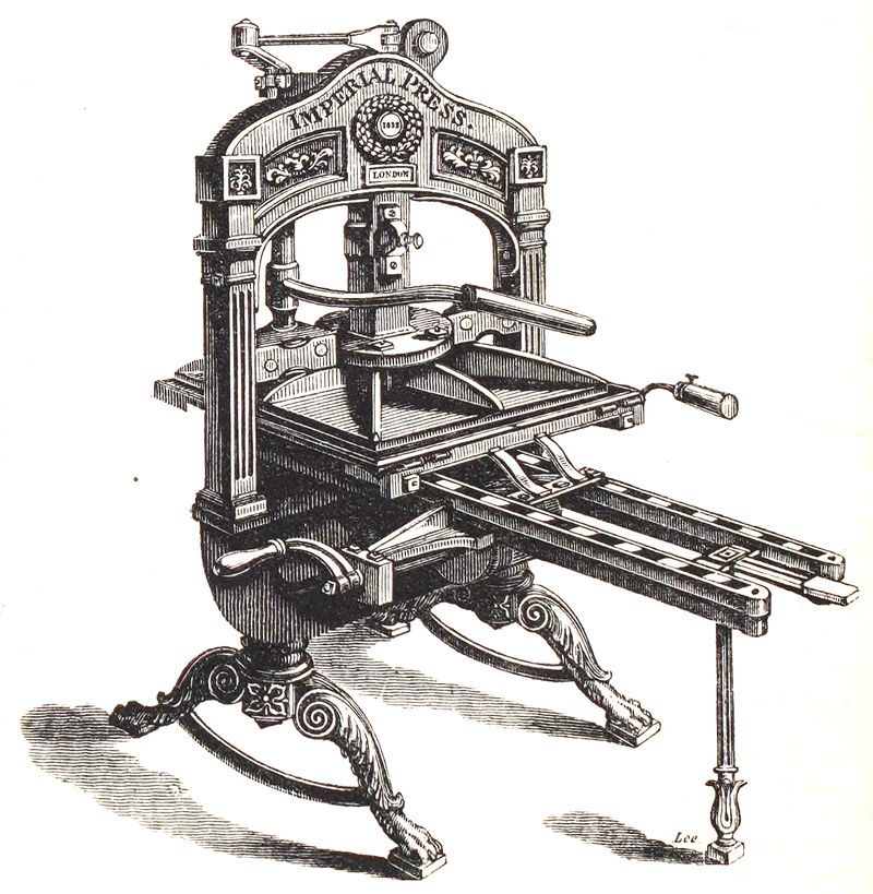
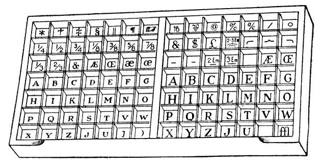
Another 160 years would pass until William Savage, also a printer by trade, published A Dictionary of the Art of Printing. It was intended as an update to Moxon’s manual, reflecting the current (as of 1840) state of moveable-type technology. He chose the structure of a dictionary to describe detailed “how-to” segments on every aspect of printing and binding a book. He widened the scope to explain all the colorful jargon of the trade, and included alphabet tables and grammatical summaries of almost every language produced by the many British type-metal foundries of that time, from Arabic and Armenian to Sanskrit and Saxon.
What does “Upper case” really mean? See “Case.” How does one fold an octavo sheet? See “Imposing.” What is a “Galley Slave”? What is a “Gathering”? What is “Brevier”? What size is diamond, pearl, emerald, or pica font? See “Types”. How much was a compositor paid for composing 1,000 letters? See “Scale of Prices.”
Savage’s dictionary has many quotes from Moxon’s manual showing how relevant it remained two centuries later, even as the technology advanced. He also acknowledges the future electrotype technology, which was starting to revolutionize the printing industry globally. (See “Galvanism.”) Although printing technology has continued to advance beyond electrotyping to lithography and phototypesetting and digital printing, it is remarkable how much of the early printing terminology remains in our language today.
The volunteers at Distributed Proofreaders are very proud to have A Dictionary of the Art of Printing as their 50,000th unique title for Project Gutenberg.
This post was contributed by jandac, a Distributed Proofreaders volunteer who post-processed A Dictionary of the Art of Printing.


 Posted by LCantoni